zondag 28 augustus 2011

SSAS/SSRS : Calculating sums and averages with M2M dimensions

Introduction
Today a post about calculating averages of departments and these measures are compared to a specific department. I have a requirement to build a report with a graph with values for a specific department. Another demand is to build a line in the graph with averages of all (?) of the departments of the organization. The report must allow the user to select the department from a dropdown list in a report parameter.  Based on the selected department the report should show measures for the selected department and an average of all departments.

There is an extra 'dimension'(!) in this investigation and that is how an average is calculated when we are dealing with a M2M dimensions. As you may know from my former posts M2M dimensions are specific parts of the star schemas methodology and SSAS:
Before we begin
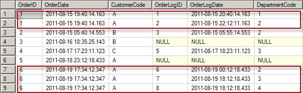
For this post i've created a lab environment for studying the average calculation of factrecords regarding M2M dimensions. I've used the same script from the post:"SSAS/SSRS : Building a graph for analyzing a subset related to the whole set". I've build a cube on these tables and it has the following structure:


SQL Analysis
Let's investigate the values in the relational tables before we investigate the OLAP cube with MDX. For this investigation w'll focus on department G and the year 2009.

1) Aggregating the results by year
In this first investigation of the totals by year shows that the FacTestCount is summarized to 35. This is a simple query and there is no involvement of the bridge table and the department dimension.


2)  Aggregating the results by year by location
In this testquery i've added an extra dimension to the query: DimLocation. As you may have expected nothing changes because the location dimension is a 'normal' dimension. No cartesian product takes place (as will happen when we include the DimDepartment dimension in the next query).


3)  Aggregating the results by year by location by Department
In the next query i've included the table DimDepartment and the bridgetable BridgeLocationDepartment and now something happens to the results: for the year 2009 the results have changed from 35 to 62. Because of the cartesian product we now have 62.


4) Aggregating the results by year by Department G
As earlier mentioned in this post w'll focus on Department G and the year 2009. In the query below you can see that we have 14 as the result of the query (for the year 2009):


Building the MDX statements
When building reports based on cubes you need to write MDX to get the data from the cube. This paragraph starts with an easy MDX query :


That is the result we would have expected because the SQL query returns also 14 for the year 2009 for department G. Now we need to write an MDX query that calculates the average (and summarization) of all departments by year. Below you can see the query i've written to calculate the following items:
  • [Measures].[Fact Test Count]. This measure is the count field in the fact and is used for summarizing (rolling up).
  • [Measures].[SUM Fact Test Count]. This a measure where the Fact Test Count is summarized by year and by department.
  • [Measures].[AVG Fact Test Count Found Departments]. This measure is calculated by taking the average of the departments that have a factrecord (and not all of departments present in the department dimension).
  • [Measures].[AVG Fact Test Count All Departments].  This measure calculates the average over all of the departments that are available in the Department dimension. Even when there a less records in the fact present related to a department.
  • [Measures].[AVG Fact Test Count All Departments2]. This measure is just a test of mine whether i could call a another Calculated member.

Okay what do we see now? We can see that the total of all departments in the year 2009 is equal to the cartesian product SQL query above (62). So that's is a desired outcome. The average by found department is 7.75 (62/8) and these are departments that do have a factrecord. The next measure is 6.2 and that is 62/10 because there 10 departments in the department dimension.

Building the report
The next thing to do is building a report with this MDX query. In this report i want to show the selected parameter in a graph and compare this to the average of departments and the sum. Perhaps not a best usability practice of building a graph but this just for showing what is possible with MDX averages, sums and graphs in reports. First build a report, create a datasource to the cube and build a dataset based on the query above. And the next thing is dragging a graph from the toolbox in the report and customize it as below. I've used the average by all departments for comparison of the chosen department in the parameter.
 
When you run the report it will look like this:


I'm not fully convinced whether i've used the right presentation of the values. I've to think about this ;-) What can we learn from such a diagram? Well, there are two years that the measure was below average and the other years showed a higher level than the select department. It depends on the context of the data what this mean, offcourse. If you're talking about profits then that it's a good thing. If you're talking about a number defects then it's a bad thing.

Conclusion

This post is about investigating the calculation of averages in relation with M2M dimensions. This post helped me understanding what is going on when i calculate an average of departments in MDX with M2M dimensions. In a discussion with my customer we talked about it and we were curious about what is being calculated in a report when an average is calculated. Does it calculate an average of the unique values or the values that multiplied by the cartesian product, does it calculate the averages over the found departments or the departments that are present in the department dimension.

Hennie

woensdag 17 augustus 2011

SQL : joining tables with the OUTER APPLY

Introduction
In many of my projects i've done sofar, i had to combine tables in order to retrieve keys for my fact tables. When there is a perfect relation available, no worries, no problem. If this perfect relation is perfectly modelled then linking and retrieving proper keys is much more easier then when there is a relation that is not based on proper relation modelling. Sometimes there are cases when you need to link sources from different departments that do not have a common primary-foreign key. Sometimes you need to link tables based on some descriptive fields that are used in both tables. The second problem is that when you do have some fields available for 'fuzzy linking', they return multiple rows back. Returning multiple rows back can cause wrong counts in your fact table. Therefore you need to align the counts of the "default fact source table" with the 'referenced table'.

For this post i've developed a small example in such a way that it represents the problem i want to examine. In the diagram below the order table is the table that is used as a source for the fact table and i need the department from the order log table to incorporate this in the (to be build) fact table.The relation is based on ''fuzzy linkage" : customer code and a date. And, i need the department key in my fact table. The problem is that there are (for the same customer and date)  multiple records with different departments. Therefore a simple distinct won't work.


In the past i've solved this with a double subqueries and this is not a good solution because the performance is bad.  I decided to investigate this problem in more dept in this post. In this post i'll discover the different options that are available to solve this problem.

I've four queries developed and these are investigated in this blog.
  • Option 1 : double subquery.
  • Option 2 : joining with subquery.
  • Option 3 : CTE solution.
  • Option 4 : OUTER APPLY solution.

The case
This is the script i've used for analyzing the queries:

USE [FuzzyLinking]
GO

IF EXISTS (SELECT * FROM sys.objects WHERE object_id = OBJECT_ID(N'[dbo].[tblOrder]') AND type in (N'U'))
DROP TABLE [dbo].[tblOrder]
GO

CREATE TABLE [dbo].[tblOrder](
[OrderID] [int] IDENTITY(1,1) NOT NULL,
[OrderDate] [Datetime] NOT NULL,
[CustomerCode] [varchar] (10) NOT NULL,
[Amount] [int] NOT NULL
) ON [PRIMARY]
GO
IF EXISTS (SELECT * FROM sys.objects WHERE object_id = OBJECT_ID(N'[dbo].[tblOrderLog]') AND type in (N'U'))
DROP TABLE [dbo].[tblOrderLog]
GO

CREATE TABLE [dbo].[tblOrderLog](
[OrderLogID] [int] IDENTITY(1,1) NOT NULL,
[OrderLogDate] [datetime] NOT NULL,
[CustomerCode] [varchar] (10)  NOT NULL,
[DepartmentCode] [int] NOT NULL
) ON [PRIMARY]
GO


IF EXISTS (SELECT * FROM sys.objects WHERE object_id = OBJECT_ID(N'[dbo].[tblDepartment]') AND type in (N'U'))
DROP TABLE [dbo].[tblDepartment]
GO

CREATE TABLE [dbo].[tblDepartment](
[DepartmentCode] [int] NOT NULL,
[DepartmentDescription] [varchar](50) NOT NULL
) ON [PRIMARY]
GO
---

INSERT INTO dbo.tblDepartment ( DepartmentCode, DepartmentDescription)
VALUES
(1, 'Department A'),
(2, 'Department B'),
(3, 'Department C'),
(4, 'Department D'),
(5, 'Department E')


INSERT INTO [dbo].[tblOrder] ([OrderDate],[CustomerCode],[Amount])
VALUES
('2011-08-15 19:40:14.163', 'A', 20.95),
('2011-08-15 05:40:14.554', 'B', 99.54),
('2011-08-16 18:35:25.143', 'B', 12.55),
('2011-08-17 17:23:11.123', 'C', 15.00),
('2011-08-18 23:12:18.434', 'A', 25.00),
('2011-08-19 17:34:12.345', 'A', 27.00);
          

INSERT INTO [dbo].[tblOrderLog] ([OrderLogDate],[CustomerCode],[DepartmentCode])
VALUES ('2011-08-15 20:40:14.163', 'A', 1),
('2011-08-15 22:12:11.163', 'A', 2),
('2011-08-15 05:55:14.554', 'B', 2),
('2011-08-16 19:35:25.143', 'C', 3),
('2011-08-17 18:23:11.123', 'C', 3),
('2011-08-19 00:12:18.434', 'A', 2),
('2011-08-19 18:12:18.434', 'A', 3),
('2011-08-19 18:12:18.434', 'A', 4),
('2011-08-20 00:12:18.434', 'A', 5);


Analysis
When i write a simple join between the Order and Orderlogtable based on 'customercode' and 'day'


SELECT
O.OrderID,
O.OrderDate,
O.CustomerCode,
OL.OrderLogID,
OL.OrderLogDate,
OL.DepartmentCode
FROM tblOrder O
INNER JOIN tblOrderLog OL ON O.CustomerCode = OL.CustomerCode
AND CONVERT(varchar(8),O.[OrderDate], 112) = CONVERT(varchar(8),OL.[OrderLogDate], 112)


this is resulting in :


As you can see we have multiple OrderID's and this is not a good situation for using this in a fact table. Instead of 6 fact records we now have 9 records and this is caused by the cartesian poduct. This is not a good base for a fact table. So we need some additional work here.

The queries

Option 1
Okay,  the first solution here is the one i've used in some of my projects (i've to admit) and that is this query:

SELECT
O.OrderID,
O.OrderDate,
O.CustomerCode,
D.DepartmentCode
FROM tblOrder O
LEFT OUTER JOIN (
        SELECT OrderLogDate, CustomerCode, DepartmentCode
        FROM tblOrderLog
        WHERE OrderLogID IN
                (SELECT Min(OrderLogID)
                FROM tblOrderLog
                GROUP BY CONVERT(varchar(8),[OrderLogDate], 112) , CustomerCode)) D ON CONVERT(varchar(8),O.[OrderDate], 112)  = CONVERT(varchar(8),D.[OrderLogDate], 112)
AND O.CustomerCode= D.CustomerCode


and this returns :


And this is ok. Now i've 6 orders back again. I choosed to take the first orderlog record and the related department. This depends on the businessrules, off course.

I'm not very satisfied with this solution because two subqueries doesn't seem a good (and a fast) solution to me.

Option 2
Another option i've researched is the query below. In this query i've reduced the subqueries to one.

SELECT
O.OrderID,
O.OrderDate,
O.CustomerCode,
OL.DepartmentCode
FROM tblOrder O
LEFT OUTER JOIN tblOrderLog OL ON OL.OrderLogID =
        (SELECT TOP 1 OrderLogID
        FROM tblOrderLog OL1
        WHERE CONVERT(varchar(8),O.[OrderDate], 112)  = CONVERT(varchar(8),OL1.[OrderLogDate], 112)
        AND O.CustomerCode= OL1.CustomerCode
        ORDER BY   O.CustomerCode, CONVERT(varchar(8),OL1.[OrderLogDate], 112))


And this returns the same values as the query in option 1:


Option 3
Yet another option i've found is the query written down below. In this query the subsubquery is now  vanished. Instead we have now a Common Table Expression (CTE) used.

WITH CTE_order AS
(SELECT
O.OrderID,
O.OrderDate,
O.CustomerCode,
OL.DepartmentCode,
ROW_NUMBER() OVER (PARTITION BY O.OrderID ORDER BY O.OrderDate) AS RowNo
FROM tblOrder O
LEFT OUTER JOIN tblOrderLog OL ON CONVERT(varchar(8),O.[OrderDate], 112)  = CONVERT(varchar(8),OL.[OrderLogDate], 112)
AND O.CustomerCode = OL.CustomerCode)
SELECT
OrderID,
OrderDate,
CustomerCode,
DepartmentCode
FROM CTE_order
WHERE  RowNo = 1 OR  OrderDate IS NULL;


Also resulting in the same results as we've seen before.


Option 4
In the next option i'm using an OUTER APPLY. The OUTER APPLY operator is used for combining tables when there is not a direct JOIN ON possible and you need to join tables based on some fields that are not keys, like in this case. So this seems a perfect match, solving this problem with the OUTER APPLY. This is the query:

SELECT
O.OrderID,
O.OrderDate,
O.CustomerCode,
O1.DepartmentCode
FROM tblOrder O
OUTER APPLY
(
SELECT TOP 1 OrderLogID, DepartmentCode
FROM tblOrderLog OL1
WHERE CONVERT(varchar(8),O.[OrderDate], 112) = CONVERT(varchar(8),OL1.[OrderLogDate], 112)
AND O.CustomerCode= OL1.CustomerCode
ORDER BY O.CustomerCode, CONVERT(varchar(8),OL1.[OrderLogDate], 112)
) O1


Resulting in.....Yep the same as before :


Comparing the queries
As i've read about the OUTER APPLY it has a better performance than subqueries or other solutions. Is this really true? Let's find out. I took the four queries and included the actual query plan and compared the costs. Studying the actual execution plan indicates that the OUTER APPLY is best option (of the four). As i already assumed the double subquery is a bad performer.


Conclusion
I've compared 4 options regarding this specific problem. The problem was about (what i call) 'fuzzy linking' between two tables and retrieving an appropriate key for the fact table. Below you can see the results in a graph and as i already thought : the double subquery is worst option (option 1) and the best solution (of the 4) is option 4 (the OUTER APPLY):


I've learned a bit more about SQL Server and the OUTER APPLY. I do think that i'll be using this feature more often in tasks like joining tables based on some not key fields.

Greetz,
Hennie

vrijdag 12 augustus 2011

SSRS: Building a report on an excel datasource with Reportbuilder 2.0

Introduction
Today a small tutorial about using an excel file as a source for a report with reportbuilder 2.0.The following steps should be followed when you're creating a report based upon an excel file.

1) Create an excelsheet with som testdata.
2) Create an ODBC DSN to access the excel file.
3) Create a datasource in reportbuilder.
4) Build a dataset and a report.

1) Create an excelsheet with some testdata
First, create a simple excel sheet with data with Excel 2007. We will build a report based on this data. Save this file under the name ImportantInformation.xlsx.

2) Create an ODBC DSN to access the excel file
As the title of the post suggested we are gonbe build a report based on an Excel sheet based on an ODBC connection. The details of how to do is listed here:

Click on Start, All Programs, Control Panel, Administrative Tools, Data Sources (ODBC). If the tabbed page is not in User DSN, change the tab to User DSN and click on the Add button.


3. Scroll down and highlight Microsoft Excel Driver (*.xlsx) and click on the Finish button.


This opens the ODBC Microsoft Excel Setup window as shown.


 Press on "Select Werkbook" and select the Excel sheet


 Press Ok and the excel file will appear in the User DSN screen


Click on OK and the window closes.

3) Create a datasource in reportbuilder
The ODBC connection has been created in the last step and now it should be possible to create a datasource in reportbuilder and connect it to the ODBC connection. Lets create a report based on this ODBC. Choose New Data source.


Set the properties Name (i didn't) and choose a connection embedded in my report. Press Build in order to create the connection string.


Choose "Use connection string" and press build (again(?)) and select the ImportantInformation.xlsx


Press OK and the Select Workbook will come up. Locate the excel sheet (i've stored mine on E:\Excel)


Press ok and Press "test connection"


And the connection string is build


The connection string is as follows:

Dsn=ImportantInformation.xlsx;dbq=E:\Excel\ImportantInformation.xlsx;defaultdir=E:\Excel;driverid=1046;fil=excel 12.0;maxbuffersize=2048;pagetimeout=5

Click on Ok en we're entering the next universe.

4) Build a dataset and the report
The  next step is create a simple report based on the data in the Excel sheet. Select "Table or Matrix".


The following window appears and you're asked for selecting the right datasource. In our case only one is created and we can't choose the wrong one here.


The next step is the most important one. Took me some trails before i got it right. Type SELECT * FROM [Sheet1$] (if you named the tab "Sheet1"). Press ! and the query is executed.


The wizard continues...


 Put some fields in the details section and Column1 in the row groups. I deselected the sum.


Choose appropriate layout.


Choose appropriate style


Press finish


Conclusion
Easy to do and this is enabling power users building reports on Excel data. Opening and closing the excel file when building the report result also in error messages in Report builder 2.0 (Something like connection lost with the excel file). This is an error i recieved when i tried to open the excel file when Reportbuilder is using the excel file:


Greetz,
Hennie

woensdag 10 augustus 2011

SSAS/SSRS : Building a dashboard

Introduction

Currently reading "Information dashboard design" of Stephen Few. A book i can highly recommend to you when you are interested in hands on advice, best practices about building dashboards. We all know the dashboardhype: everybody wants a dashboard. Dashboards are sexy. Building a good dashboard is about giving the users a unique and powerful means to presenting information, but they rarely fullfill their promisses. Too bad, because building a dashboard according to the usability rules can greatly enhance insights. During my study i became interested in building applications according to the usability laws that were researched by Don Norman, for instance. One book of him, that is very easy to read and give you great insights of the (bad) design of everyday things, is his famous book : The Design of Everyday Things. In this book he explains some bad examples and some good examples of design of normal things that surrounds us. Great book and when your designing dashboards it could give you some background information.

In this post i'll describe building a piece of a dashboard. In the coming weeks, months i will regularly post some blogs about building pieces of dashboards according to best practices or some great ideas that i've seen in the book of Stephen Few. While reading the book of Stephen Few i got interested in building a sober dashboard and i would like rebuild them in Reporting Services. One example i find particularly interesting. You can find this on page 201, left under. Below you i will show you the end result that i've build with Reporting Services.


First
At first we need to set up a environment in which we can build a dashboard. For this purpose i've created the following SQL Script :

USE [dashboard]
GO

IF EXISTS (SELECT * FROM sys.objects WHERE object_id = OBJECT_ID(N'[dbo].[FactSales]') AND type in (N'U'))
DROP TABLE [dbo].[FactSales]
GO

CREATE TABLE [dbo].[FactSales](
[FactSalesID] [int] IDENTITY(1,1) NOT NULL,
[FK_Date_Key] [int] NOT NULL,
[FK_Department_Key] [int] NOT NULL,
[FK_Product_Key] [int] NOT NULL,
[FactSalesCount] [int] NOT NULL,
[SalesAmount] [money] NOT NULL
) ON [PRIMARY]
GO

IF EXISTS (SELECT * FROM sys.objects WHERE object_id = OBJECT_ID(N'[dbo].[DimDepartment]') AND type in (N'U'))
DROP TABLE [dbo].[DimDepartment]
GO

CREATE TABLE [dbo].[DimDepartment](
[Department_Dim_key] [int] NOT NULL,
[Department_Code] [int] NOT NULL,
[Department_Description] [varchar](50) NOT NULL
) ON [PRIMARY]
GO

IF EXISTS (SELECT * FROM sys.objects WHERE object_id = OBJECT_ID(N'[dbo].[DimProduct]') AND type in (N'U'))
DROP TABLE [dbo].[DimProduct]
GO

CREATE TABLE [dbo].[DimProduct](
[Product_Dim_key] [int] NOT NULL,
[Product_Code] [int] NOT NULL,
[Product_Description] [varchar](50) NOT NULL
) ON [PRIMARY]
GO

IF EXISTS (SELECT * FROM sys.objects WHERE object_id = OBJECT_ID(N'[dbo].[FactPurchaseOrder]') AND type in (N'U'))
DROP TABLE [dbo].[FactPurchaseOrder]
GO

CREATE TABLE [dbo].[FactPurchaseOrder](
[FactPurchaseOrderID] [int] IDENTITY(1,1) NOT NULL,
[FK_Date_Key] [int] NOT NULL,
[FK_Department_Key] [int] NOT NULL,
[FK_Product_Key] [int] NOT NULL,
[FactPurchaseOrderCount] [int] NOT NULL,
[FactPurchaseAmount] [money] NOT NULL
) ON [PRIMARY]
GO

IF EXISTS (SELECT * FROM sys.objects WHERE object_id = OBJECT_ID(N'[dbo].[DimDate]') AND type in (N'U'))
DROP TABLE [dbo].[DimDate]
GO

CREATE TABLE [dbo].[DimDate](
[Date_dim_key] [int] NULL,
[Date_Year] [int] NULL
) ON [PRIMARY]
GO

INSERT INTO dbo.DimDepartment (Department_Dim_key, Department_Code, Department_Description)
VALUES
(1, 1, 'Department A'),
(2, 2, 'Department B'),
(3, 3, 'Department C'),
(4, 4, 'Department D'),
(5, 5, 'Department E')

INSERT INTO dbo.DimProduct (Product_Dim_key, Product_Code, Product_Description)
VALUES
(1, 1, 'Product 1'),
(2, 2, 'Product 2'),
(3, 3, 'Product 3'),
(4, 4, 'Product 4'),
(5, 5, 'Product 5')

INSERT INTO dbo.DimDate
VALUES (0,2000),
(1, 2001),
(2, 2002),
(3, 2003),
(4, 2004),
(5, 2005),
(6, 2006),
(7, 2007),
(8, 2008),
(9, 2009),
(10, 2010),
(11, 2011),
(12, 2012),
(13, 2013),
(14, 2014),
(15, 2015)


INSERT INTO [dbo].[FactSales]([FK_Date_Key], [FK_Department_Key], [FK_Product_Key], [FactSalesCount], [SalesAmount] )
VALUES

(8, 5, 2, 1, 6.25),
(8, 2, 3, 1, 5.96),
(8, 3, 1, 1, 2.95),
(8, 1, 1, 1, 4.98),
(8, 3, 5, 1, 20.00),
(8, 5, 5, 1, 100.00),

(9, 3, 1, 1, 12.70),
(9, 2, 1, 1, 22.67),
(9, 4, 4, 1, 56.16),
(9, 5, 2, 1, 23.16),
(9, 2, 3, 1, 22.13),
(9, 1, 1, 1, 100.12),

(10, 1, 3, 1, 50.0),
(10, 2, 1, 1, 39.95),
(10, 3, 2, 1, 66.05),
(10, 5, 1, 1, 40.95),
(10, 3, 4, 1, 6.05),
(10, 5, 5, 1, 1.95),

(11, 1, 3, 1, 50.0),
(11, 3, 1, 1, 39.95),
(11, 3, 5, 1, 66.05),
(11, 1, 2, 1, 23.0),
(11, 3, 4, 1, 55.95),
(11, 3, 2, 1, 78.05)


INSERT INTO [dbo].[FactPurchaseOrder]([FK_Date_Key], [FK_Department_Key], [FK_Product_Key], [FactPurchaseOrderCount], [FactPurchaseAmount] )
VALUES

(8, 3, 5, 1, 66.67),
(8, 5, 1, 1, 25.00),


(9, 1, 2, 1, 21.95),
(9, 2, 5, 1, 80.45),

(10, 3, 2, 1, 51.02),
(10, 5, 1, 1, 30.05),

(10, 1, 3, 1, 21.00),
(10, 2, 1, 1, 19.95),
(10, 3, 2, 1, 21.05),
(10, 5, 1, 1, 15.95),

(10, 1, 3, 1, 60.0),
(11, 3, 1, 1, 30.95),
(11, 3, 5, 1, 31.05)


---
This script will create some tables and will insert some data into the appropriate tables.

Building the cube
The next thing we need to do is building a cube based on this datamodel. Below you can see the structure of this cube.


An image can you tell more than the SQL script above. So i'll explain the case with aid of this diagram. There are two facts Salesorder and purchase order. There are a couple of conformed dimensions :Department, Date and Product. The idea behind this that you need to purchase a product before you can sell it. I don't think i have the purchases in line with the sales. It is just an example. Another dimension POStatus is used for analyzing the status of a purchase order. Below the dimension usage tab:


Building the report
Okay, now it's time to build the report. The first thing is dragging the fields needed in the query designer into the query window.


Just plain and simple.

In the reportinfg services i've dragged a tablix on the report. In the dashboard example i've 7 columns and below you can see how i've created them in the tablix.

1) Product description (Desc)
The product descritption field in the table is simple. It's the product description of the product. This product description is used for grouping the products.

2) Last five years sparkline
I've created a sparkline graph based on the sales amount and a year column.


3) Number (# 2011)
In order to determine the current year i'm using the Globals!ExecutionTime as a rundate. The # column is calculated by summing the counts in tha fact table
=SUM(IIF(Fields!DateYear.Value = YEAR(Globals!ExecutionTime), Fields!Fact_Sales_Count.Value, 0))

4) Amount ($ 2011)
As described at point 3, The salesAmounts are summarized by grouping the products.

   =SUM(IIF(Fields!DateYear.Value = YEAR(Globals!ExecutionTime), Fields!Sales_Amount.Value,0))

5) Percentage of total (% $/total (2011))
Calculating the perccentage betwee the productsales and the total product sales is done by the following expression

 =SUM(IIF(Fields!DateYear.Value = YEAR(Globals!ExecutionTime), Fields!Sales_Amount.Value,0),   "grpProductDescription")/
SUM(IIF(Fields!DateYear.Value = YEAR(Globals!ExecutionTime), Fields!Sales_Amount.Value,0), "tblxSalesPerProduct")

6) Since last year
Calculating the percentage of growth or decline is a bit more difficult. Below you can see the expression i've created. Most of the expression is build around the demand that a - (minus) and + (plus) should be shown in case of a decline or a growth.

=IIF(

    SUM(IIF(Fields!DateYear.Value = YEAR(Globals!ExecutionTime), Fields!Sales_Amount.Value,0)) > SUM(IIF(Fields!DateYear.Value = YEAR(DATEADD("yyyy", -1, Globals!ExecutionTime)), Fields!Sales_Amount.Value,0)),
    "+" + FORMATPERCENT(CSTR(SUM(IIF(Fields!DateYear.Value = YEAR(Globals!ExecutionTime), Fields!Sales_Amount.Value,0))/
    SUM(IIF(Fields!DateYear.Value = YEAR(DATEADD("yyyy", -1, Globals!ExecutionTime)), Fields!Sales_Amount.Value,0))),0),

    "-" + FORMATPERCENT(CSTR(SUM(IIF(Fields!DateYear.Value = YEAR(Globals!ExecutionTime), Fields!Sales_Amount.Value,0))/
    SUM(IIF(Fields!DateYear.Value = YEAR(DATEADD("yyyy", -1, Globals!ExecutionTime)), Fields!Sales_Amount.Value,0))),0)
)


7) AVG $ (2011)
The last column that i've created is the avg $ (average sales). That is done by aggregating (sum) and dividing the amounts and the counts.

=SUM(IIF(Fields!DateYear.Value =YEAR(Globals!ExecutionTime), Fields!Sales_Amount.Value, 0))/SUM(IIF(Fields!DateYear.Value = YEAR(Globals!ExecutionTime), Fields!Fact_Sales_Count.Value, 0))


Other Tablix adjustments
There are two more important adjustments to the report: sorting and filtering. The sorting is about sorting the products according their sales effort (regarding to the whole sales). The filtering is about the top 3 bestseller products.
Sorting
Sorting the products is possible by clikcing on the grouping of the products (and not  tablix level).


Click on sorting.


And use the following expression for sorting the products. I only implemented the amount. That's enough.


Filter top 3
The last last change in the report is filtering the top 3 products. The filter option that is used is also on the group level.

Below you can see the expression that i've used for filtering


And the expression that i've entered in value field is (don't forget the =) :

=3

And end result.....


Conclusion
The example in the book of Stephen Few has a sparkline as the first column. I haven't read the complete book of Stephen and i do not know why he decided to put the sparkline in the first column but from usability view point i do think that product description should be the first colum. Humans read from top left to bottom right and they are interested in productdescriptions, first.

woensdag 3 augustus 2011

SSAS/SSRS : Building different gauges with MDX.

Introduction
For one of my customers i've to build a dashboard. This customer wants to improve the quality of service. There are discussions about how do you measure quality, what is good service and what is bad service. The problem is that there are many departments and how do you compare them. Is it recommended to say below 50 is ok and above is not ok? So what is good and what is wrong? Just showing the number is also a bad practice (without any reference).

Another approach i've read in the book of Stephen Few : "Information dashboard design" and he showed an example of a gauge with an organization average and an industry best practice (benchmarking). Below you can see a diagram about combining the department average, organization average and an industry best practice. An other idea pops in my mind about comparing departments peer2peer with same departments of  other organizations.


So in theory there are four measures possible for comparing values.
  • Department average.
  • Organization average.
  • Industry best practice.
  • Peer2peer department average (for later).
Red, orange and green imply a judgement of the figures. So i decided not use these colors. At this moment i'm using more neutral colors like purple and darkblue.

Prerequisites
Okay, let's setup the case. First setup the datamodel and insert some test data. Below i've drawn a star datamodel with two facts a department level fact and a benchmark fact (for showing the industry best practice average). The department level fact is a fact with data from the own organization and the benchmark fact is information that is gathered, stored, processed and distributed by an exernal benchmark organization. For simplicity i'll assume that the one measure of department level fact will be compared with the measure of the benchmark fact. In the real world there will be multiple organizations star schemas and they need to be coupled with the benchmark fact.


So there four dimensions : OrgDepartment, Date, organization and P2Pdepartment (for later blogposts). So i've created a script for  this purpose.


USE [Gauge]
GO

IF EXISTS (SELECT * FROM sys.objects WHERE object_id = OBJECT_ID(N'[dbo].[DeptLevelFact]') AND type in (N'U'))
DROP TABLE [dbo].[DeptLevelFact]
GO

CREATE TABLE [dbo].[DeptLevelFact](
[DeptLevelFactID] [int] IDENTITY(1,1) NOT NULL,
[FK_Date_Key] [int] NOT NULL,
[FK_Department_Key] [int] NOT NULL,
[DeptLevelFactCount] [int] NOT NULL
) ON [PRIMARY]
GO

IF EXISTS (SELECT * FROM sys.objects WHERE object_id = OBJECT_ID(N'[dbo].[DimDepartment]') AND type in (N'U'))
DROP TABLE [dbo].[DimDepartment]
GO

CREATE TABLE [dbo].[DimDepartment](
[Department_Dim_key] [int] NOT NULL,
[Department_Code] [int] NOT NULL,
[Department_Description] [varchar](50) NOT NULL
) ON [PRIMARY]
GO

IF EXISTS (SELECT * FROM sys.objects WHERE object_id = OBJECT_ID(N'[dbo].[BenchMarkFact]') AND type in (N'U'))
DROP TABLE [dbo].[BenchMarkFact]
GO

CREATE TABLE [dbo].[BenchMarkFact](
[BenchMarkFactID] [int] IDENTITY(1,1) NOT NULL,
[FK_Date_Key] [int] NOT NULL,
[FK_Organisation_Key] [int] NOT NULL,
[BenchMarkFactCount] [int] NOT NULL
) ON [PRIMARY]
GO

IF EXISTS (SELECT * FROM sys.objects WHERE object_id = OBJECT_ID(N'[dbo].[DimDate]') AND type in (N'U'))
DROP TABLE [dbo].[DimDate]
GO

CREATE TABLE [dbo].[DimDate](
[Date_dim_key] [int] NULL,
[Date_Year] [int] NULL
) ON [PRIMARY]
GO

IF EXISTS (SELECT * FROM sys.objects WHERE object_id = OBJECT_ID(N'[dbo].[DimOrganisation]') AND type in (N'U'))
DROP TABLE [dbo].[DimOrganisation]
GO

CREATE TABLE [dbo].[DimOrganisation](
[Organisation_Dim_key] [int] NOT NULL,
[Organisation_Code] [int] NOT NULL,
[Organisation_Description] [varchar](50) NOT NULL
) ON [PRIMARY]
GO
---

INSERT INTO dbo.DimDepartment (Department_Dim_key, Department_Code, Department_Description)
VALUES
(1, 1, 'Department A'),
(2, 2, 'Department B'),
(3, 3, 'Department C'),
(4, 4, 'Department D'),
(5, 5, 'Department E')


INSERT INTO dbo.DimDate
VALUES (1,2000),
(2, 2001),
(3, 2002),
(4, 2003),
(5, 2004),
(6, 2005),
(7, 2006),
(8, 2007),
(9, 2008),
(10, 2009),
(11, 2010),
(12, 2011),
(13, 2012),
(14, 2013),
(15, 2014),
(16, 2015)

INSERT INTO dbo.DimOrganisation (Organisation_Dim_key, Organisation_Code,Organisation_Description)
VALUES
(1, 1, 'Organisation X'),
(2, 2, 'Organisation Y'),
(3, 3, 'Organisation Z')

INSERT INTO [dbo].[DeptLevelFact]([FK_Date_Key],[FK_Department_Key],[DeptLevelFactCount])
VALUES
(10, 1, 3),
(10, 2, 5),
(10, 3, 8),
(10, 5, 1)


INSERT INTO [dbo].[BenchMarkFact]([FK_Date_Key],[FK_Organisation_Key],[BenchMarkFactCount])
VALUES
(10, 1, 3),
(10, 2, 5),
(10, 3, 7)


Building the cube
Based on the script above i've created a cube. This structure of the cube can be seen in the diagram below:


I've deployed  the project and the next step is building the report.

Building the report
Now let's start another session of visual studio (BIDS) and to create a new report. I've added the following query to the dataset.

WITH
MEMBER [Measures].[avg measure by all departments] AS
    AVG({[DimDepartment].[DepartmentDescription].[DepartmentDescription]},
    [Measures].[DeptLevelFactCount])
MEMBER [Measures].[avg measure by department C] AS
    AVG({[DimDepartment].[DepartmentDescription].&[Department C]},
    [Measures].[DeptLevelFactCount])
MEMBER [Measures].[avg measure by all Organisations] AS
    AVG({[DimOrganisation].[OrganisationDescription].[OrganisationDescription]},
    [Measures].[BenchMarkFactCount])
SELECT
{
[Measures].[avg measure by all departments],
[Measures].[avg measure by department C],
[Measures].[avg measure by all Organisations]
}
ON COLUMNS
  
FROM ( SELECT ( { [DimDate].[DateYear].&[2009] } ) ON COLUMNS
    FROM [Gauge])
WHERE ( [DimDate].[DateYear].&[2009] ) CELL PROPERTIES VALUE, BACK_COLOR, FORE_COLOR, FORMATTED_VALUE, FORMAT_STRING, FONT_NAME, FONT_SIZE, FONT_FLAGS


And i've dragged some gauges on the dashboard.
.


The radial gauge (1) is the one i initially preferred but while reading more about the usability of this diagram the less i prefer (see below for the usability tips). The second is a linear gauge and is like a thermometer. The third is also a linear gauge but with ranges. This would imply that a indicator is judged somehow in right or wrong. The fourth lineair gauge is a gauge with precentages.  I didn't manage to change the percentages into absolute numbers. And the last gauge (5) is the same as 2 but horizontal positioned.

Usability tips
From studying (old study) books, internet,  etc i can give you some handy tips and best practices when you're developing gauges and dashboards:
  • The first tip is don't use radial gauges (1) ;-) in your dashboard because they use a lot of space and the added value is low. If do want to use gauge in your dashboard, use the lineair gauge (2, 4 or 5). This diagram uses less space on your dashboard and gives you the same information.
  • When you do use the radial gauge don't punt the numbers on the inside of the scale. Put them on the outside of the scale. This way the pointer won't overlap the numbers. This will enhance faster readability of the gauge.
  • If you're using the radial gauge put the markers on the inside.There are three options available and this the least worst option. The other options are outside and cross. The outside option could cover the numbers with the marker and cross will do the same but centers between the inside and the outside option. So i would recommend using the inside option.
  • In the example i used multiple indicators for an average of all departments and an average of all other organisations. I used different color for these indicators. But one thing i did not manage was adding a label (avg departments or avg organisations) to the indicators. For beter readability i would have liked that. Again this would have enhanced readability. Perhaps i'll find out in the future.
  • The use of colors is also an important choice. In number 2 and 5 i've used red as a color and red indicates as there is a danger, problem, etc. In this example is the color red not a very good choice.

Conclusion
There is a lot possible with these gauges and you can play for hours with these things. I think that dashboard design is not about putting all kind of gauges, diagrams, graphs on a window but you have to think about how to present the information on the screen for the best usability possible. That's the challenge when you're developing a dashboard.

Greetz,
Hennie