Hi,
A pareto chart (by Vilfredo Pareto) is a graphical way of highlighting the most important among (typically large) set of factors. This type of chart contains both bars and a line graph. The bars display the values in descending order, and the line graph shows the cumulative totals (cumulative percentage) for each category, left to right. In my current project i''ve to analyze all kinds of events and i'm thinking about using a pareto analysis.
I used a simple query from the SSRS recipes book and i started experimenting with this:
SELECT NON EMPTY { [Measures].[Internet Sales Amount] } ON COLUMNS, NON EMPTY { ([Sales Reason].[Sales Reason].[Sales Reason].ALLMEMBERS ) } DIMENSION PROPERTIES MEMBER_CAPTION, MEMBER_UNIQUE_NAME ON ROWS FROM [Adventure Works] CELL PROPERTIES VALUE, BACK_COLOR, FORE_COLOR, FORMATTED_VALUE, FORMAT_STRING, FONT_NAME, FONT_SIZE, FONT_FLAGS
Drag a chart on the report and put the sales reasons on the category groups and internet sales amount in the details.
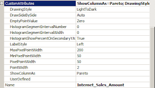
Experimenting with the custom attributes of the columns (chart series, clicking on the histograms) like this (don't forget to set the ShowColumnAs property
Will show a pareto diagram :
Conclusion
At first i thought that the pareto was a separate diagram in the toolbox but it is not. So the most important thing to do is setting the custom properties in the chart series (click on the bars). One thing i have to find out is get a line on 80% for determining what categories are responsible for 80% of the sales.
Greetz,
Hennie


Geen opmerkingen:
Een reactie posten